

This blog is part of our series, breaking down features and details of Adobe Experience Manager’s adaptive forms. In particular we will be looking at AEM adaptive forms panel layout options, going into detail about each page navigation style, and giving you our thoughts and suggestions on when each style is most appropriate for your needs.
But, what is page navigation?
Page navigation is the term we coined to describe different adaptive form panel layout options. In-effect they are the same, and we use both terms throughout this blog. We’ve found that describing page navigation options is an easier term for users to understand, compared to form panel layout options.
Ok, but why should I care?
Much of what drives a user’s journey through a form is in the layout and design of the adaptive form. We at Apto Solutions have a multitude of ways of designing forms in a way which promotes ease of navigation and a better overall user experience.
Long or complex forms can become increasingly difficult to navigate for users. Having everything on on page becomes inefficient and cumbersome to work with. Therefore, we utilise a diverse range of layout options for any type of adaptive form.
So what are the different layout options within adaptive forms?
Tabs, Accordion and Wizard Style, are all layout options within adaptive forms. These are some of the most frequently used and will all be discussed in this blog. They can also be seen in our AEM Forms video.
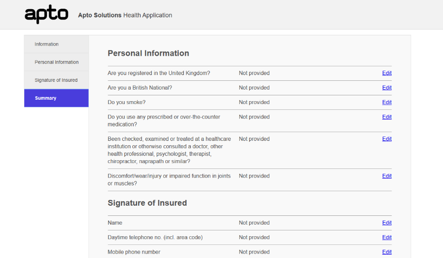
Tabs navigation
Possibly the simplest method of page navigation AEM provide is the Tabs style layout option.
This allows you to tabulate the sections of your form resulting in a much easier navigation for users. It is a quick and easy method of navigation that all users should be familiar with. Forms can be grouped into key sections so that form users can easily navigate from section to section.
We recommend this style for intermediate to long forms with clear sections for each part of the form. However if the forms sections are too granular this style can be detrimental, as the number of tabs needed can become confusing. Extremely long forms can also suffer, unless you implement nested tabs. Nested tabs give you much greater control by further breaking down sections and reducing the amount of top-level tabs required which in turn, simplifies forms.
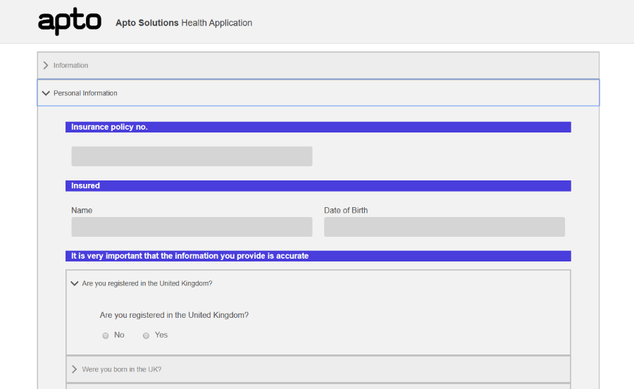
Accordion navigation
Accordion is another powerful solution to ease navigation for adaptive form users. Instead of separating forms into pages using tabs, a developer can section pieces of the form into collapsible panels instead. This will limit the amount of information on the page at one time, specifically driven by the user.
A user could have every section of the form open at once, or only have the currently needed panel, then easily switch between them.
Accordion is great at saving space visually and therefore we recommend it for short to moderate length forms. However much like tabs, for long forms the number of panels can result in a confusing form. It becomes difficult to find the correct panel if the user has to navigate too many panels to find the panel they are looking for.
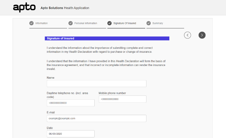
Wizard navigation
Wizard places a navigation banner at the top of the page, similar to the tab style. Users can then click through the different pages of the form.
Next and previous buttons enable user to easily navigate to each section giving quicker access and a better user experience.
The main benefit of the Wizard style is when sections are filled in, the section icon updates to a tick, representing it as being complete. In workflow situations this is most advantageous when forms are passed between users.
We recommended this for shorter or workflow style forms, with clear sections to be completed. The navigation bar at the top is only suitable for a small to moderate number of sections in a form, otherwise it can become cluttered, with too many headings. As mentioned before, a good use of this style is for different users to fill out different parts of the form, with each section showing completed for each user, giving clarity and ease of use.
How do I change navigation options in AEM
This final section will show you how easy it is to switch between these different page navigation options within the adaptive forms editor.
Firstly, navigate to your adaptive form. From the AEM home page, select Form, then Forms and Documents. Here you will see your form or the folder structure in which your form should be located.
Hover over your form and click on the tick and select “Edit”.
Using the root panel component on your Adaptive Form, you can then change its layout type by clicking “Configure” on the component (the spanner icon) and then selecting your option from the “Panel Layout” dropdown.
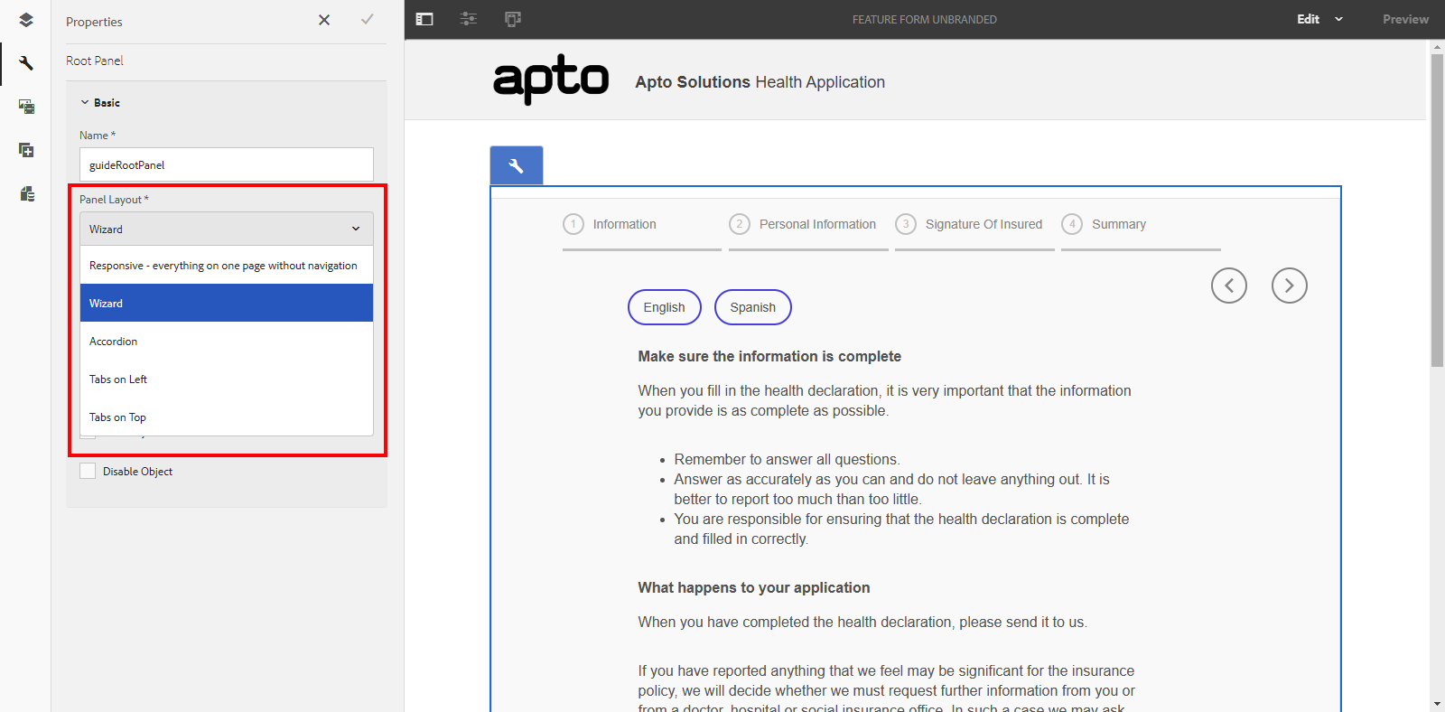
From this dropdown you can select whichever layout you wish to use on your page. Have fun experimenting!
Coming soon
Thank you for reading and checkout our other blogs in this series
-

28 June 2024
Data Processing – Part 2 – Platforms Compared
-

19 June 2024
Apto Partners with Cribl to Enhance SIEM Data Management
-

14 June 2024
Splunk .Conf24 Wrap Up
See how we can build your digital capability,
call us on +44(0)845 226 3351 or send us an email…